Most colour wheels failed to isolate hue from lightness and chroma, so we can’t rely on them to make appealing colour palates. Luckily, the oklch colour space (oklch.com) separates the three elements of colours beautifully. Go play around with their colour picker. You will have a better understanding in colour.
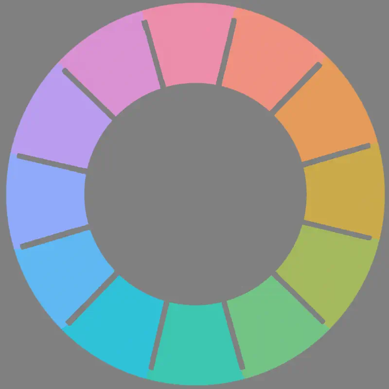
Here’s a interactive color wheel I made.
Details about colours:
- The 12 hues are evenly distributed, meaning they all looked distinct.
- But at extreme lightness or high chroma, some colours don’t exist and wheel will be forced to show the nearest colour.
- Chroma = 0.12 and Lightness = 75 is the highest chroma value that doesn’t cause gaps in the hue spectrum under the sRGB colour gamut.
Hue
Contrasting colours pairs are located at the opposite sides of the wheel, which are 180 degrees away. Pink and turquoise, red and cyan, orange and sky blue, yellow and ultramarine blue, lime and purple, and finally, green and magenta. A palate will look great if the colours used are evenly seperated, like 60 degrees (triangle) or 45 degress (square) from each other.
Lightness
On this wheel, all the colours are adjusted to the same lightness. This cures our colour bias.
We thought colour have meanings but some of those are due to their innate lightness. We may thought yellow is happy and joyful but that’s just because yellow is brightest when saturated. Similarly, we may thought blue is calm and melancholic but that just because blue is darkest when saturated. from this colour wheel, we learnt that ‘gloomy yellow’ and ‘joyful blue’ exist although they not as colourful.
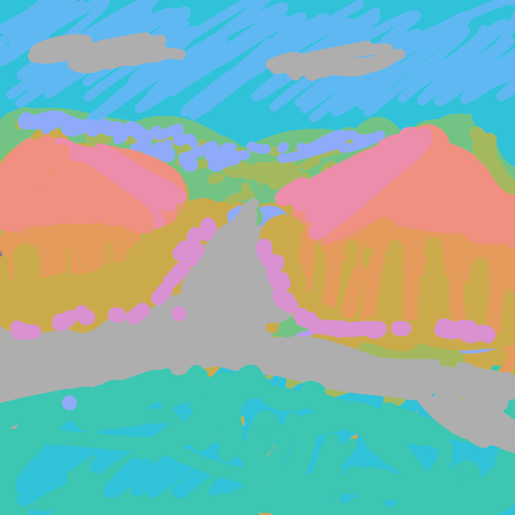
Using colours with equal lightness, we can create a mystic and almost unnerving effect, the colours are almost like glowing at the boundaries, as presented in the following drawing.
This drawing is completely dull in terms of lightness. We can’t feel any sense of depth from this picture. This confuses our eyes and feels illusionary.
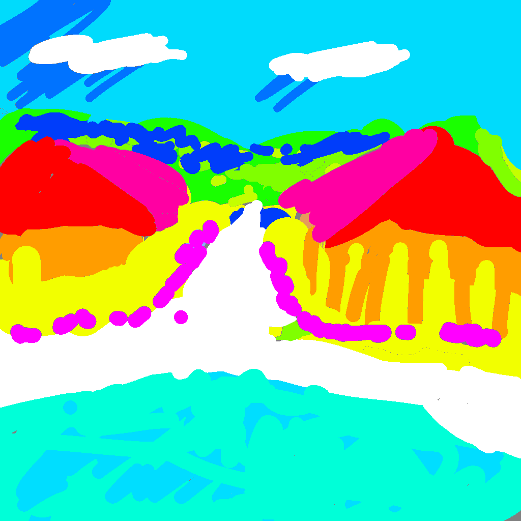
Now repaint it with the preset colour palate from MS Paint. This surely looked childish, but somehow it still looks more pleasant than the above one. That because contrast in lightness are reintroduced.
Chroma
If we darken the computer screen, everything on the screen we see becomes darker, but the colours doesn’t change. That’s because each pixel still shows the same ratio of light frequencies.
I made colour charts to show colours at different chroma. I haven’t find out how to use them yet but they surely looked great. It also makes me wonder what creates the bumps in this chart.
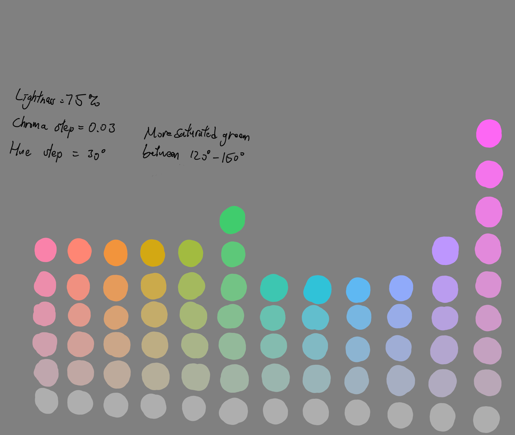
It would be great if I can use it directly in painting software.